Thursday, April 11, 2013

The Pursuer, Final Artwork

Artwork Title : The Pursuer 
Art Movement :  Relational Art
Reference Artist : Brad Troemel
Theme : Social Media Issues

Artist statement  :
The original idea of this artwork is to portray keyboard warriors as a social media issue. Keyboard warriors are basically people who wage war on the Internet. I do believe that our society has become reckless at times when using social media due to the anonymity that we obtain from the Internet. Therefore, I was inspired to come out with this final artwork based on the idea of keyboard warriors.

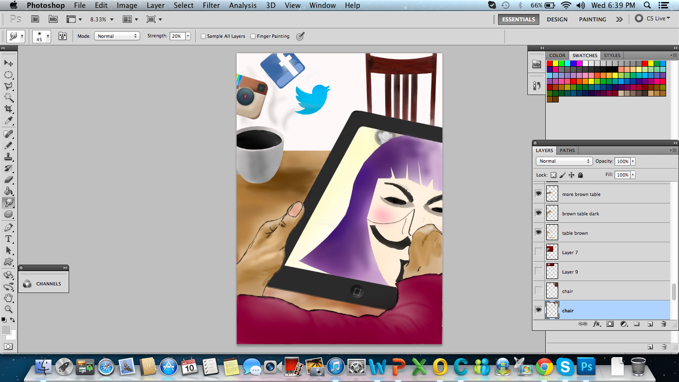
I included 'Vendetta' as part of this artwork because of the symbolism of this character. To put it simply, I quote Alan Moore, writer for V for Vendetta - "Behind this mask there is more than just flesh. Beneath this mask there is an idea... and ideas are bulletproof." 


Artwork by : Tang Ruxyn
Student ID : B1002820


I used this as the underdrawing for this design project.


First of all, I painted the shirt, hands and ipad. I created different layers when painting so that it will be easy for me to do any editing later on.


Then I painted the cup (reference below) and table and also Vendetta's face. I pay a lot of attention in adjusting the settings for the brush in order to get the correct tones for the colours in this part.


Next, I re-painted the shirt to get the results that I want. Then painted a chair and also the social media icons using some reference (listed at the end of this blogpost). I started to refine the details like adding a lightbulb behind Vendetta, choosing the correct colours for the icons and adding the 'smoke' effect by using brush and smudge tool.


Now is the probably one of the tricky parts in completing this design project. I had to constantly adjust the opacity for the layers I've created especially for the ipad in order to create a realistic effect to show that Vendetta is actually appearing as a reflection. Finally, I did the final touch-ups and it's done!


The Pursuer


References: 

Cup - http://img.ehowcdn.com/article-new/ehow/images/a02/3l/ct/do-cup-through-table-magic-800x800.jpg 
Facebook - http://jonbennallick.co.uk/wp-content/uploads/2012/08/Facebook-logo-ICON-02.png
Instagram - http://www.opensecrets.org/news/instagram-logo-icon.jpg
Twitter - http://theinspirationroom.com/daily/design/2012/6/new_twitter_logo.jpg


Please refer to the following posts to see in detail how I've come to finish this artwork :
Research on theme and issue (link)
First Sketch (link)
Second Sketch (link)
Crafting (Part 1) (link)
Crafting (Part 2) (link)


Wednesday, April 10, 2013

Crafting (Part 2)


So, from my last post, you know that I've coloured the hands, shirt and ipad. 


Next, using my favourite magnetic lasso tool again, I made the selection and coloured Vendetta's hair. I chose brown because it signifies that this person was just like any other ordinary person. I also try to make the hands look better. 


Now, going into the fine details of colouring Vendetta's face, I zoomed in and chose the right brush opacity, hardness and flow in order to make the correct face impact.


Here's after I finished colouring the face and giving details like nose, moustache, eyebrows.


So the next part, I used this picture (link) as a reference to colour and draw my cup because in my sketch, I felt like the cup lack some elements of depth and perspective. So I open the image I found in photoshop as a layer in the same document, then, creating a another layer to paint the cup and also the shadow.


The cup was really difficult to colour! Spent a lot of times adjusting the brush settings to get the result that I want. The next part, I started to colour the table, as seen in the screenshot above.


After that, I fixed the shadow. Earlier, the shadow was too dark, it look like spilled coffee to me. Haha. I also added a white background layer at this point. After looking at my colouring, I decided to change Vendetta's hair colour to purple. Initially, I felt like portraying this person as ordinary so I used brown but I feel more happy when I coloured the hair to purple. Why purple? Because I feel that this person, craves for attention and he or she daring enough to do things differently.


Now, I coloured the Instagram, Facebook and Twitter logo. I used the images I found online (here, here and here) as reference to select the correct colour. I did this by pasting the images in the same document as layers, then using the eyedropper tool, I picked the right colour.


Next, I added the 'smoke effect' from the cup using brush once again and also smudge tool. I also painted a chair this time. As you can see from the screenshot above, I also painted a lightbulb on the ipad (behind Vendetta's head). This is to show the reflection from the light above and behind this person.


I don't know what struck me but suddenly I feel like colouring green for the background (wall). :/ Don't seem right though. But notice I made some adjustments on the shirt. I repainted it.


Unsatisfied with the chair and background, I deleted the chair layer and created a new layer to re-colour a new chair, with a different style. I also deleted the green background layer.


In order to create the 'reflection', first, I changed the blending options for the background in the ipad. I changed the blend mode to 'difference' and fill opacity to 94 percent.


Next, I created a new layer (Layer 21 - I didn't name this layer), used polygonal lasso tool and used a brush to colour it black on top of the ipad.


I adjusted the master opacity of Layer 21 to 83 percent, so that it it looks more like a reflection. 


In order to make things even more realistic, I tried to add rays of light reflection on the ipad with 50 percent opacity.


I added 'i'm watching' using the text tool with 'chalkduster' font set with 15 percent opacity to add more impact to the artwork. I've decided to leave the background wall to be white colour.

And it's finished! 

References: 

Cup - http://img.ehowcdn.com/article-new/ehow/images/a02/3l/ct/do-cup-through-table-magic-800x800.jpg 
Facebook - http://jonbennallick.co.uk/wp-content/uploads/2012/08/Facebook-logo-ICON-02.png
Instagram - http://www.opensecrets.org/news/instagram-logo-icon.jpg
Twitter - http://theinspirationroom.com/daily/design/2012/6/new_twitter_logo.jpg


Thursday, April 4, 2013

Visitation to Central Market

I missed the class trip because I had back-to-back classes. So I went instead with my friend, Vivian because I had a 3-hour break time. The trip was refreshing (although I was actually sweating due to the heat) because it's been a very long time since I last took public transport to anywhere.

Here's some of the pictures I took on that day when I went to Central Market:


Exactly 125 years! Wow


Saw some scouts outside. 


Tourists.


This is an elevator! Super cute design.


Tourist, tourist, tourist everywhere.


Visited the Annexe Gallery section in Central Market, didn't take much picture there cause mostly the owners didn't allow. There were a lot to see, and all are for sale. Sadly, I don't think I could afford to buy any of them at the moment.

It's been years since I last went to Central Market and I'm surprised with the things that they sell here. The things here are considerably cheap, I was expecting them to be expensive since it's a tourist hotspot.

One thing I realized from visiting Central Market is that tourists (mostly Westerners) seems to appreciate art more than us. They want to learn more about our culture. Honestly, how often do we find ourselves in art galleries, let alone admiring art in Kuala Lumpur? There's a lot of things around us that we don't pay attention to. But these little details are the ones that make life wonderful. : ) Imagine yourself in a world without colours and details, it will all become dull.

Also, graffiti is usually frowned-upon and seen as a form of vandalism. But as I looked at Pasar Seni LRT station, I find that it's a form of expression that everyone yearns. It's good that graffiti artists can have a canvas to work on here, legally. It's also a good sign that Malaysia is learning to embrace art even more. I'm happy. : )


Thursday, March 28, 2013

Crafting (Part 1)

After my sketch was approved, I used the sketch as an underdrawing for the rest of the project.


I began by colouring the (sleeve of the) shirt. I chose to use red colour because red colour symbolizes passion, energy, confidence and courage. I used the magnetic lasso tool and brush when colouring the shirt.


Next, I started to colour the hands, also added outline to the hands. In order to draw the details properly, I zoomed in most of the time and referred to the underdrawing.


After I finished colouring the hands, I moved on to colour the ipad. Also giving details like adding the button below. The free transform tool is really handy in adjusting the button to the correct angle. Notice that I also have made some improvements to the shirt at this point. The magnetic lasso tool and polygonal lasso tool has been very useful so far. 


... To be continued :)


Wednesday, March 20, 2013

Sketch 2


My sketch has been approved! Sorry it's not very clear here. 

The idea of this sketch is to portray how a keyboard warriors could be among us, in our normal environment. Keyboard warriors are just like any other ordinary people. Don't be surprised if you see a person just sipping his or her favourite coffee at a corner... and find out that he or she is actually a keyboard warrior!

The social media icons seems to emerge from the coffee symbolizes the consumption of the different social media by keyboard warriors, giving the person energy and excitement (similar effect to drinking coffee).

Why the Vendetta mask? Because Vendetta could be both - a hero or a villain. It's up for you to decide. So, it's the same for keyboard warriors. To some, they are 'heroes'. To some, they are 'villains'.

Happy that I can now proceed to crafting ; ) 


Friday, March 15, 2013

First Sketch


Sorry the scan is not very clear but it's my first sketch. The idea is a keyboard warrior. The soldier (representing the modern warrior) is holding a keyboard as the weapon. At this person's core is the different social media that he uses, which means that the social media is 'heart' that keeps this person going and living.

Feedback from lecturer is that the idea of the sketch is not very original. True. So I'm sketching another soon.

Need to squeeze more brain juices!


Wednesday, March 13, 2013

Research on theme and issue

"Social Media Issues". That was the theme given to us by our design lecturer. There's just too many issues that come out of social media. Well, while I was searching on the theme and issue for this design project, I remembered about an article I read on newspapers about a year ago. You can read it online (here).

Yes, keyboard warriors. 

Of course, there are a lot of extremes and degrees but I believed that we have succumbed to being a keyboard warrior at least once? Why do I say so?

Haven't we find ourselves become so comfortable typing behind our keyboard sometimes? Remember those times when you were gossiping about someone else with another friend? Or simply leaving a nasty comment and trying to remain anonymous?

Yes.

So, I've decided that this is indeed a social media issue and I'd like to explore more on this and use this idea for my design project.

So long for now!


Wednesday, February 27, 2013

Field Trip To National Art Gallery

Had a fruitful trip to the National Visual Arts Gallery yesterday with classmates. Most of the art that was exhibited was by Latiff Mohidin because the theme was  "6 Decades of Latiff Mohidin: A Retrospective". A collection of paintings, drawings, prints and even sculptures could be found here, and all are works from Latiff Mohidin. The painting series by Latiff Mohidin that were exhibited here includes Pra Berlin, Berlin, Pago-Pago, Mindscape 1, Langkawi, Mindscape 2, Gelombang, Rimba and Voyage. I like the Berlin series the most.

There were also other arts that were exhibited on the 1st floor and one of my favourites was this one by Khairul Azuman Ishak titled, "Syaitan Bersepuluh" means which Ten Devils (rough translation). The visual art was made of charcoal on paper. This piece was a huge one and on the drawing, we can see ten figures of the same face sort of like whispering to the main character in the middle. There was some kind of eerie feeling that I felt, especially since the hall wasn't very lit up. Not sure why was the lighting very bad either, I think to put in some feeling. I think the art appealed to me because of the meaning that I obtained from it. It somehow portrays the ten 'devils' as mischevous, trying to whisper something into the main man. The main man was actually frowning as if he wasn't happy and somewhat confused.

As a mass comm student and one that will venture into the world in such a field, I think one of the things that I can do to create more awareness about art and design is to increase exposure. How? I think we are all aware how powerful social media can be, especially when it's used correctly. We see how Instagram has gained success over the past few years. I think people generally love seeing beautiful things - pictures and visuals. What they don't know is that they are deprived from real art! I mean, it's not there's no "fake art" around us, of course. However, I think it's time Malaysians gain some real exposure about artists around us. Using social media, we can share about what we think about art and also post some really good posts about the art scene in Malaysia rather than post some gossip, right? I always believe word-of-mouth marketing is always most effective.

Sunday, February 24, 2013

Vintage Pop Art Design Tutorial

I tried to make a vintage pop art design using this tutorial (link). I did this on two different PC/laptop. For some steps, I used Control+Click (Windows) or Command+Click (MAC).

Here's my first attempt. 

1) First I searched for a vintage kind of paper (link) and use it as my background


2) Then, I created a new layer and name it "clouds" above the "paper" layer. I did this by selecting the foreground and background colors (pressing D) and then to go Filter > Render > Clouds. I used the eraser tool (with 0% Hardness) and deleted some of the area of the clouds randomly. Then, I changed the "clouds" layer blending mode to ColoR Burn and Opacity to 75% 

3) Using lasso tool, I removed the white background from this man (link) and paste the image into somewhere at the bottom right corner.


4) I used a soft black brush and brush it across the man's head so I can't see it now. I added a layer mask (Layer Mask > Reveal All) to the reading man layer. Then, I added the head of a dog (link) on the man. Using the Magic Wand, I deleted all the white background of the picture and user a eraser tool to round the neck area a little bit. I find this the hardest to do. 

5) I placed the dog's head over the neck of the reading man, and hide the dog head layer for a while. Using the lasso tool, as the tutorial taught, I selected and copy some parts of the man's suit and shirt and even the hair and paste the selection over the "Dog Head" layer. I als o erased some tiny areas of the dog's neck to make it fit right into the shirt.  I took some time to complete this step as I was trying to find the right angle.


6) I erased the dog's neck to make the join softer, and then pressed Control + U to adjust Hue/Saturation to match the man's hair colors.

7) Then, I put "Reading Man", "Dog Head", and the tiny shirt selection layers into a new folder. Then I converted the folder into a new Smart Object and named it "Man-Dog".


8) Using some guides, I selected the Man-Dog smart object and placed the book in the middle of the design. Then, I duplicated the Smart Object. Also, apply a Motion Blur angle of 0ยบ, a Distance of 50px, and place the layer below the original.

I also changed the "Man-Dog copy" Blending Mode to "Color Burn" and set the layer’s Opacity to 25%. Next, I set the "Man-Dog" layer Blending Mode to Hard Light. Finally, I moved the "Clouds" layer above all the layers in layer’s palette.


9) This part is VERY tricky. I downloaded the sunburst custom shape (link) and kept the book area clear. In order to use the sunburst shape, I need to load it first. Then, I rasterized the shape by clicking on Layer > Rasterize > Shape. Then, I changed the layer Blending mode to Overlay and set the Opacity to 75%.


10) I Control-Click the "Man-Dog" layer’s miniature to make a selection. Then, selected the "Sunburst" layer and delete the selection. Then, I applied a new Layer Mask > Reveal All to the "Sunburst" layer. Then, using some splatter brushes (with Opacity at 80%, Flow at 80%, and Color of black), draw a few random black splatters in the layer mask.


11) So, I gave the "Man-Dog" layer a Drop Shadow Spread of 0% and a Distance of 15px.

12) This step is to add patterns to the design. I created a new document with a size of 50 px by 50 px and paste this image (link) after downloading. Then go to Edit > Define Pattern and save it with a name like 'Pattern 101' or anything you like.
.
Back to our main document, I drew a Rectangle (shape or selection) into a new layer above the "Clouds layer" and name it "Texture 1". Then, I filled it with red color(you can put any color) and go to Effects > Pattern overlay. I find the pattern that I just saved and press OK.

Then I rasterized the pattern by creating a new blank layer above the "Texture 1" layer, then merge both layers by selecting both and pressing Command + E. Finally, using the Sponge Tool, Desaturate some areas of the rasterized pattern.

13) Now, I apply a Layer Mask > Hide All to the "Texture 1" layer. Then using a 50px white Brush with a Hardness of 100%, draw a shape to make some areas of the pattern visible.

14) Now, I Control-Click the "Man-dog" layer miniature to make a selection of the man’s shape. Then I clicked the "Texture 1" Layer Mask miniature. Select the Fill Tool, set the foreground color as black, and fill the selection. Finally, I changed the "Texture 1" Blending mode to Multiply.


15) I added another pattern to the design, found over here. To convert them into a repeating pattern, I just crop a 50px by 50px square from the original picture, then just repeat Step 12 of this tutorial (apply the Pattern Overlay to a rectangle, Merge the image, and Desaturate some areas using the Sponge Tool).

16) Apply a Layer Mask > Hide all to "Texture 2" layer, then using the same 50px white brush, paint some random zones of the layer mask.

17) Control-Click the "Man-Dog" layer and make a selection. Then fill that selection into the "Texture 2" Layer Mask just as I did in Step 14.

18) I changed the "Texture 2" layer Blending mode to Multiply. I Control-Click the "Texture 2" Layer Mask on the Layers Palette to make a selection of the mask shape. Then click the "Texture 1" Layer Mask, and using the Fill Tool (Black foreground), fill the selection. To finish this step, select the "Texture 2" layer and apply a Color Overlay effect using the values at bottom of the following image. 

19) The hard work is almost done! I found some images and paste them anywhere in the document. Then I Free Transform each one to place them into a nice position. I applied a Drop Shadow effect to each work using the values shown below. Also, adjust the Hue/Saturation of each word using the following values as well.


20) I used these three pieces: onetwothree to add text on it later on. I used an irregular Eraser Tool to delete some areas of the paper sheets to give them a torn effect, apply a Drop Shadow style to each paper layer using the values shown below. Finally, burn some areas of the paper pieces using the Burn Tool.
21) I added some letters above the paper pieces, use any random font, but set every text layer Blending mode to Vivid Light.
22) Now add some text over the background paper, I used a font named Gigi, set the text layer’s Blending mode to Overlay, and duplicate it to make a strong Overlay.
23) ANDDD. It's done!

Not too bad for the first try eh?


Wednesday, February 20, 2013

Art Movement


Apparition of a Face and Fruit Dish on a Beach by Salvador Dali
Image source: (HERE)

Out of the many art movements, one of the art movements that I'm most interested in is surrealism. Surrealism was founded by Andre Breton as an artistic expression and as I researched deeper, I found out that Surrealism is a philosophy that was based on Freud's (one of the fathers in psychology) subconscious motivation. 

One important element in surrealism is the juxtaposition of images either by placing two images that has no logical connection with one another or by creating forms of unexpected materials. Both the viewer and the creator of the image can have different interpretations of the art because of the unrelated imagery and unlimited boundaries due to the free association that is available for the viewer and creator. Usually, our logic limits our own creativity because we don't want people to say the art doesn't make sense. Surrealism let us to go beyond what we think is logical and search deep to find meaning in the subconscious. 


The Scream by Edvard Munch
Image source: (here)

The painting above needs no introduction as the The Scream is a really popular painting that was created by expressionist artist Edvard Munch. When I see the painting, the first impression that I get is the feeling of distortion and agony.

From what I understand, expressionism allows artist to distort reality in order to bring out an emotional experience and to find meaning through emotions for artist and the viewer (Bruce Thompson). Expressionism lets people to explore the world around them and it's a very subjective type of art as it is based on the personal emotions of the artist. Usually, we would be able to find elements of exaggeration in expressionism because exaggeration is used to enhance the emotional effect. 

I find this quote by Alexej von Jawlensky very fitting. He said, "The artist expresses only what he has within himself, not what he sees with his eyes." I believe that the art movement of expressionism allowed artists to be more expressive in their art. I feel that the artists then must have been individuals who are very bold as most of the time, we are afraid of expressing ourselves because we are afraid that people would judge us. Since expressionists integrated their emotions into art, we can also know a lot about an artist or painter through their paintings or art.